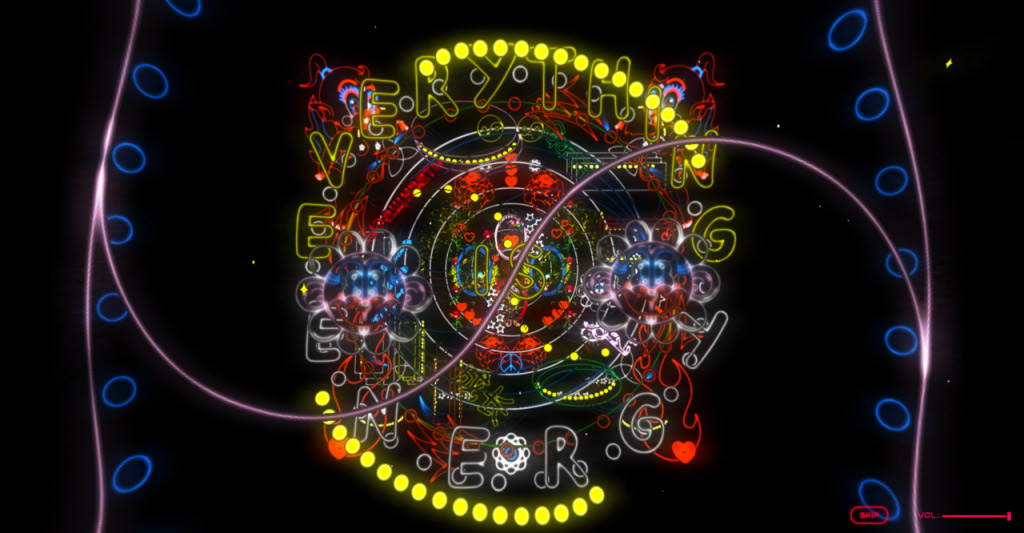

One of our long time users Artur Neufeld created an amazing web experience with cables.
We asked him if he could do an interview with us to explain more about how the project came to be.
Links :
https://wideawake.earth/
http://www.arturneufeld.com/
1 - How did this project start out, what were the end goals?
Wide Awake is the brainchild of illustrator Friederike Hantel and fashion designer Ethel Vaughn. The project started as Friederike’s master thesis, and she contacted us at Selam X
and asked just for some guidance and tips, on how to approach such a
project on a larger scale. So we met for a coffee and just started
talking about the project, its possibilities, and its potential. We were
instantly intrigued by her ideas and style and were on board
immediately and decided, that the potential of the project would be
untapped if the whole collection would just be a bland online shop like
any other. So we decided to go all-in on the holistic approach, treating
the project as a brand and elevating it with a multimedia treatment.
The goal was to launch the collection with a big bang, so it can be
taken more serious on the international stage and get the attention that
it deserves. We were all in this project because we think it is
something worth to support, so it started more as a personal project,
but we of course hope, that it will get bigger as we go.
2 - Can you elaborate on how the creative process led to the final result?
The
first meeting with Friederike was back in September of 2018. It turned
out, that she and I live basically in the same neighborhood, so it was
easy to meet up, discuss plans and creative directions on a semi-regular
basis. In the beginning, we had even more ambitious plans, from AR and
face filters to VR and motion cap. One core idea of the project was its
collaborative spirit, so we asked other creators to pitch in ideas and
transform her imagery into something new. 3D artists brought her visuals
to a different dimension, sound designers brought the visuals to life,
makeup artists, models, and photographers delivered fitting images for
the lookbook. All participating creators had absolute creative freedom,
and that made the project so fun and diverse. The concept for the
website shifted dynamically, as we got new visuals from the other
creators and the main challenge was to wrap everything into a coherent
story. In the end, we went with the concept of layers, closely related
to the aesthetic of comic books. So the creative process was really a
trial and error kind of thing, were we ping-ponged ideas and visuals,
and at some point, someone would say “What if we would do that?”. So.
e.g. that the lookbook pictures would open to fullscreen, with the
borders and visuals aligning dynamically, was just an idea that came
naturally after I received her first sketch for the lookbook visuals.
3 - Why did you decide to use Cables to build this web page?
The
first draft of the website already had this idea of a visual journey,
the working title was “Kosmos” since we wanted to tell a story that went
from the universe scale all the way to the microscopic level. As
mentioned, the concepts shifted and changed a lot, so only remnants of
the kosmos idea survived in the end. I was glad to use Cables in this
process since its modularity allowed me to quickly change ideas on the
fly. At some points, the journey was more of an auto scroller, so adding
e.g. the possibility to scroll the scenes with the mousewheel was easy
to implement, without the headache of refactoring the logic all the
time. So the dynamic creative approach went hand in hand with cables
modularity, which made the whole process a lot more fun. Otherwise, I am
sure, I would have been more reluctant to new ideas and more careful
when discussing new possible features or concepts. Now I could say “yeah
that’s a neat idea, not sure if it is possible but let me quickly make a
prototype”. And Cables enabled me to have this mindset.
4 - Can you tell us about any challenges that you faced during the development process?
In
the end, we had this huge amount of layers for the interactive WebGL
journey, around 300 to 400 individual PNGs. So as you can imagine, this
resulted in all kinds of issues, from performance to loading times and
Http requests, this layering approach was influencing everything. So one
challenge was optimization, so from enabling gzip on the serverside, to
carefully squeezing every bit from each PNG with different compression
methods, to baking different image effects right into the PNGs, like
blur/neon effects, and splitting the whole thing into thematic scenes.
In the end, I would say, that the loading time is still too long, but we
were at a point, that the only way to improve the loading time, would
be to cut out scenes or reduce the overall amount or quality. So we
decided to sacrifice a few seconds on the loading time in the end
because the result was interesting and unique enough to justify that
decision in our opinion.
5 - Anything else you want to share?
Mhh just as a tip for newcomers, or anyone using cables, in general, I guess: Get accustomed to the CLI
that Cables provides. In this project, I needed to tweak values all the
time and needed to see it in action on my dev server, so I quickly
hacked together a python script that automates the process of getting
the new patch file from the Cables API. That alone really speeds up the
workflow when working with bigger and more complex patches. Another
thing I really learned to appreciate is the impact of a good compression
method for assets. Since our PNGs had a limited color palette and big
chunks of transparent areas, I could save up to 80% of the filesize, by
using something like PNGQuant in a batch operation. If you don't have hundreds of images, you can also use something like TinyPng on your assets, before going to production with the project.
We’d
like to give a big thank you to Artur for taking the time to respond to
us. We can’t wait to see what other projects he’ll come up with.

One of our long time users Artur Neufeld created an amazing web experience with cables.
We asked him if he could do an interview with us to explain more about how the project came to be.
Wide awake earth
