Hello,
another two months have passed since the last blogpost for an update. As planned we are doing smaller updates now and hence had one "in between" at 13th of January (scroll down here for changes in that release).
This release closes ~90 issues and includes ~20 bug fixes. This is not the reason for this post though.
We made some breakthrough changes in the UI of the editor that we'd like to introduce to you.
Let's get into it:
Editor-UI changes
We reworked a lot of the menus and icons that appear in the cables editor.
The goal of the whole rework is to give you smaller menus, more structure and also more consistent icons. The most notable change
is that we got rid of the customizable sidebar (as we felt nobody is really using this anyhow) and putting the editor on the full
height of the window to give you coders a bit more space.
Along with that came new smaller menus and a few animations as gimmicks here and there. Sounds small? Sounds easy? Well, quite some work went into this, we promise!
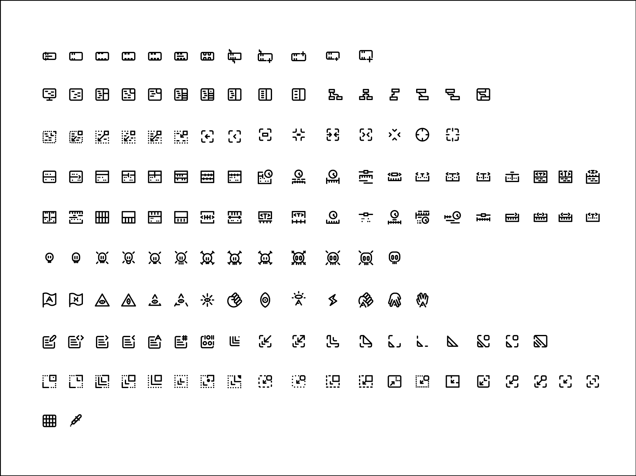
We designed new icons to go with our new UI style. We made sure to keep them in the same style of the open source
feathericons designs, since they are already super awesome, minimalistic and were already being used for some UI elements in cables.
It wasn't an easy task, so we've made sure to try allot of different directions. As you can see, some icons design worked others didn't.
Maybe the feathericons collection is in need of some awesome illuminati and skulls icons?
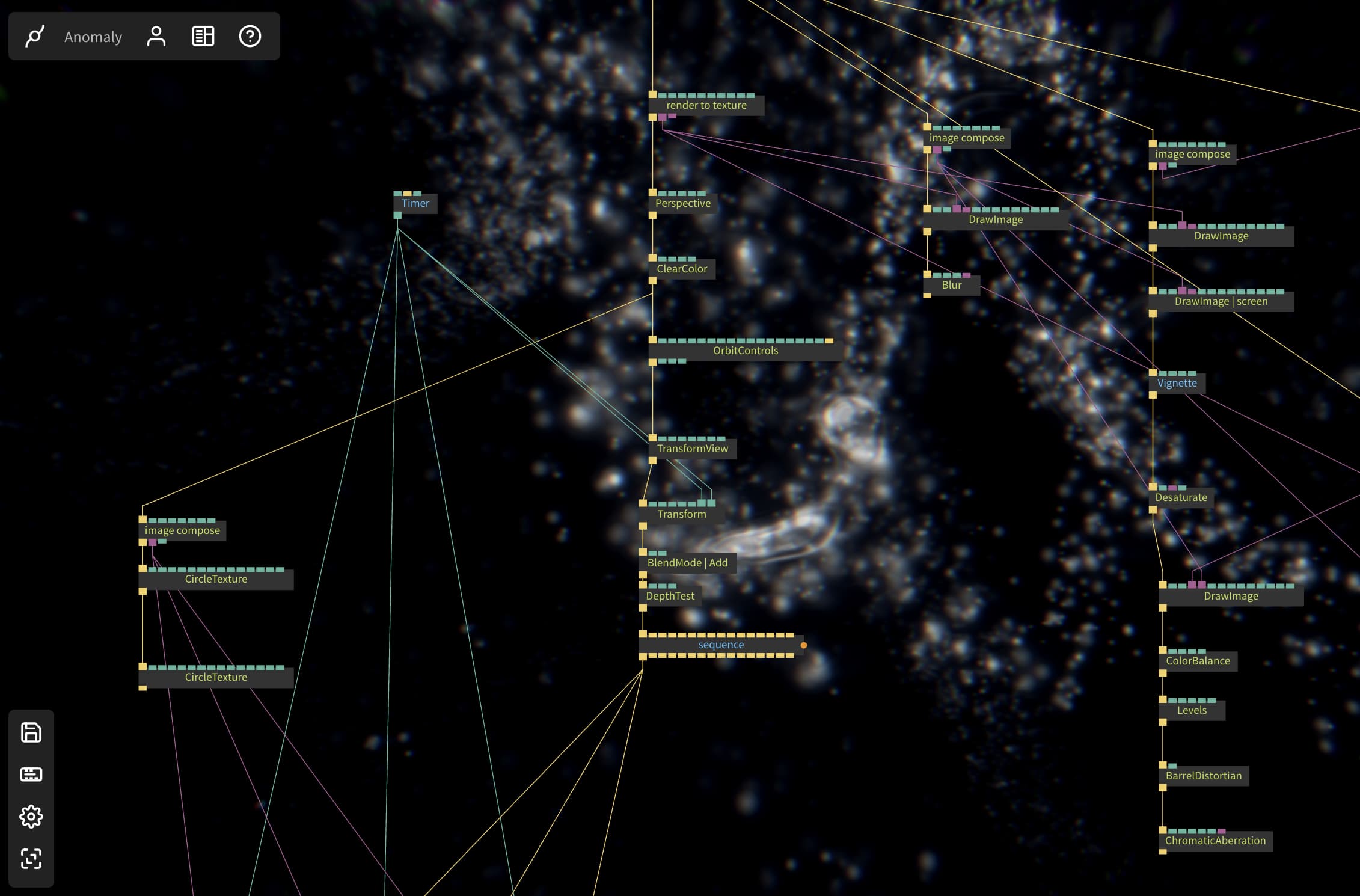
For those of you who always wanted to be more "inside" of your patch, we now offer the ability to have the renderer as a patch background.
This has been a bit of a religious topic over the last years, and we might head into "curved cables vs. straight cables"-territory here, but we found that sometimes it's nice to see your patch in a higher resolution while still working on it. So now you have the choice by using ctrl/cmd-shift-enter:

Most of the menus in the editor got smaller, received animations here and there and also have been repositioned. You still find the main menu on the top, it moves to the right when opening the code-editor now. The configurable sidebar made way for a smaller version with all the important shortcuts. A new one is the icon bar on the lower right that lets you zoom in and out and turn on full screen, handy if you do not have a mouse wheel for example. All of these will undergo some more changes in the future, but we are quite happy with the new foundation...hope you are, too.
Refined Audio-Ops
We added a Delay op that gives you the possibility to add delay, warble and grittiness to existing audio streams. The documentation has also been updated!
A lot of bug fixes, tiny updates and more user-friendly UX with already existing audio ops, check out the changelog for more.
ClockSequencer lets you sequence triggers based on BPM values,
In combination with ClockSequencerPattern it is possible to sequence rhythms like a drum machine
Fiddle around with the ClockSequencerPattern and different array & trigger ops and start to explore the generative music possibilities
We added two more ops for that: the MusicalNotes op gives you all the arrays you need to define musical scales, the ArrayQuantizer op lets you quantize incoming values to those scales
Triggerwarning!
This release also gives you two new ways of controling the flow of your patches through triggers.
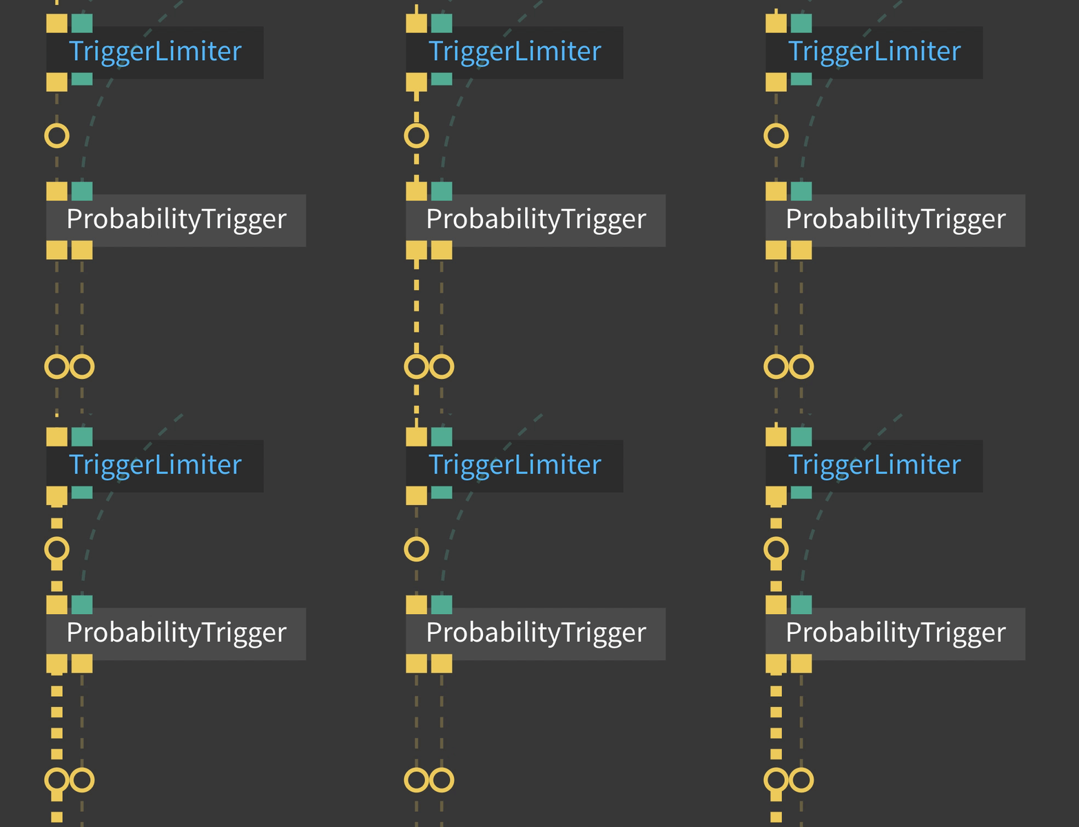
The ProbabilityTrigger rolls a dice every time it is triggered and outputs a trigger with a given probability, if you need the inversion of that, it will also trigger the second out-port whenever the probability is not met. A nice way to bring some "randomness" into your visuals, but still keep a bit of control.
TriggerReceiveFilter will receive all the named triggers that you already use with TriggerSend and TriggerReceive and then (optionally) filter these by a given prefix on the name. Going all over the place with your triggers from left to right in patches and subpatches can now be a lot more structured. Fire and forget!
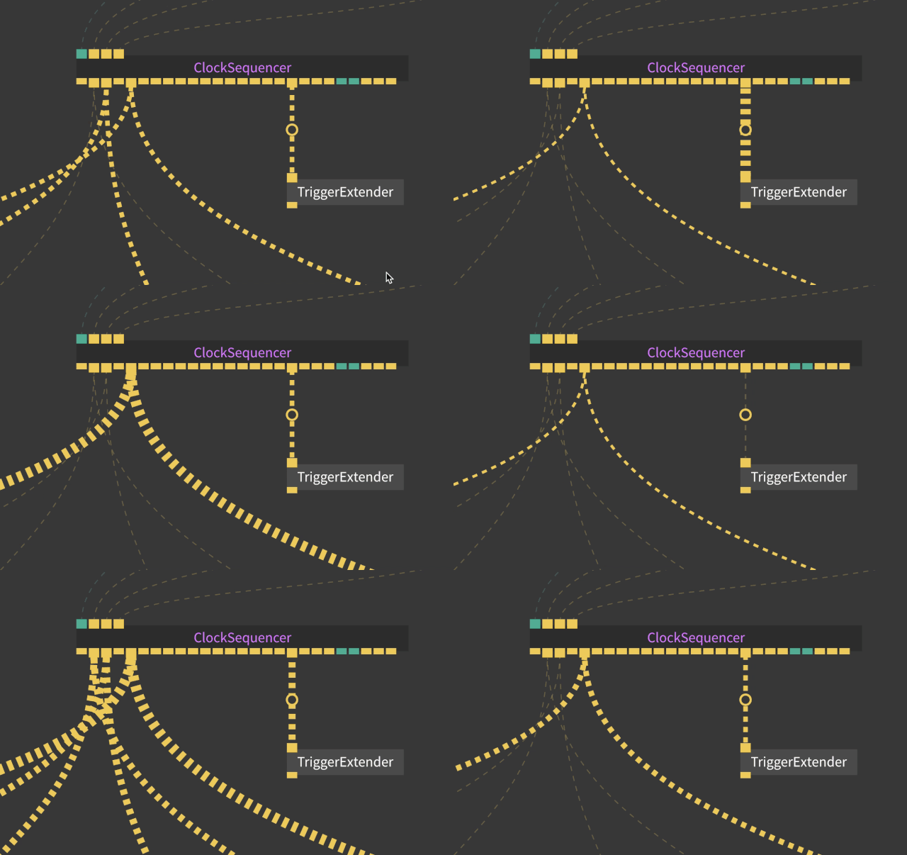
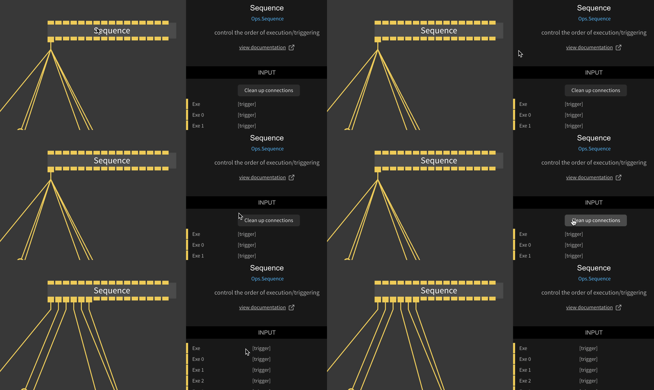
Spending (most of) your time untangling a lot of cables? Triggers especially have the habit of accumulating on outports. We gave the Sequence op a "clean up" function to make your live just that one missing bit easier:
Custom Ops
Ever wanted to create an op but not clutter your UserOps namespace? Only need this specific functionality in this patch? Need a small snippet of JavaScript that executes in place? Think this one problem you have can be better solved in code instead of patching?
We got you! The new CustomOp gives you the ability to code ops, or basically any JavaScript, and have it stored along your patch and not in UserOps. Perfect for these instances where "nocode" is not the solution...
Made with cables
We always love seeing what you people do with cables "in the real world" and "
made with cables" is our place to celebrate and showcase this.
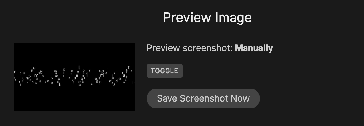
To give you more control on how your work is presented on, say "made with cables", or any social media site, we now allow you to create a screenshot on demand. Manually picking the face of your patch, so to say.
Once you turn on this feature in the patch settings, cables will no longer attempt to automatically create screenshots and keep your selected version until you grab a screenshot again. So get your patches into the most beautiful position and hit that button.
And last but not least:
We added the echarts and p5js libraries for use in your UserOps. Let us know what you do with it!
As always you can find all the changes in our
changelog. Enjoy all the new stuff, and: happy patching!
the cables team

