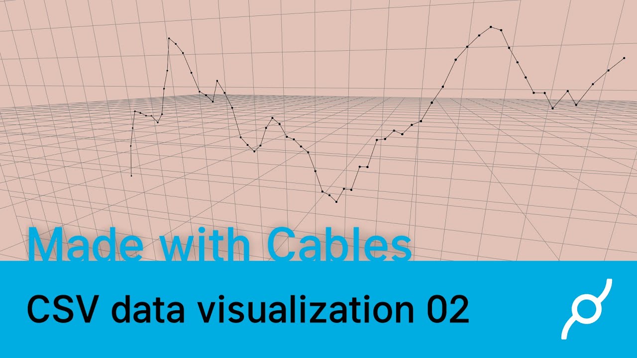
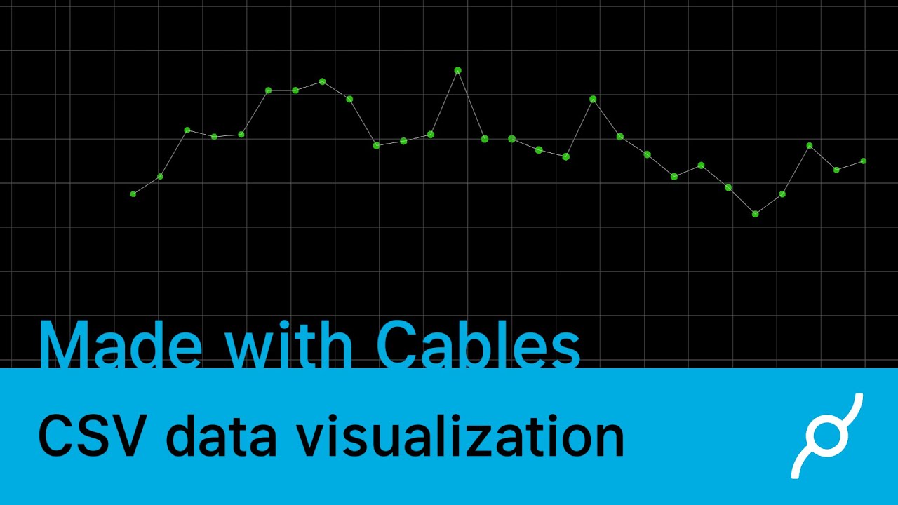
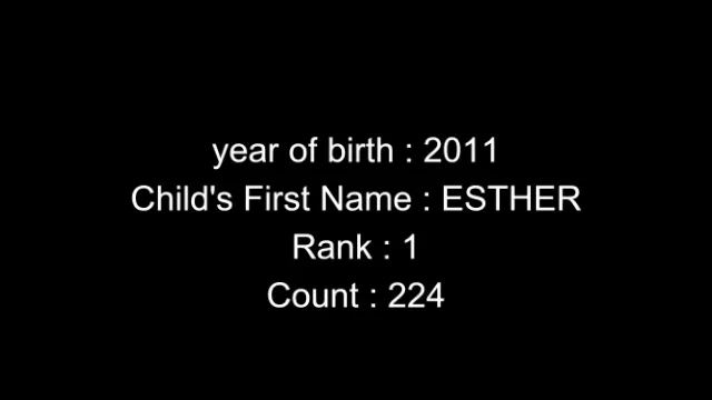
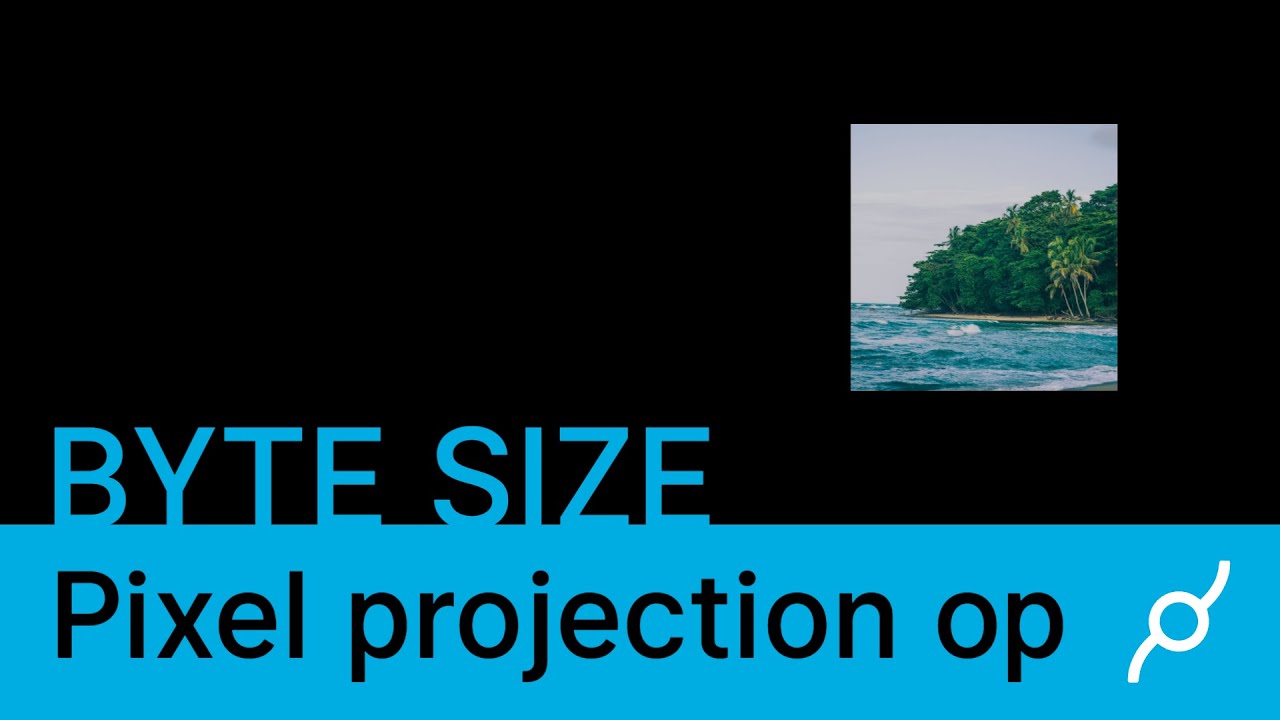
Our 2nd tutorial video of data visualization will show you how to visualize CSV data as a graph inside of cables
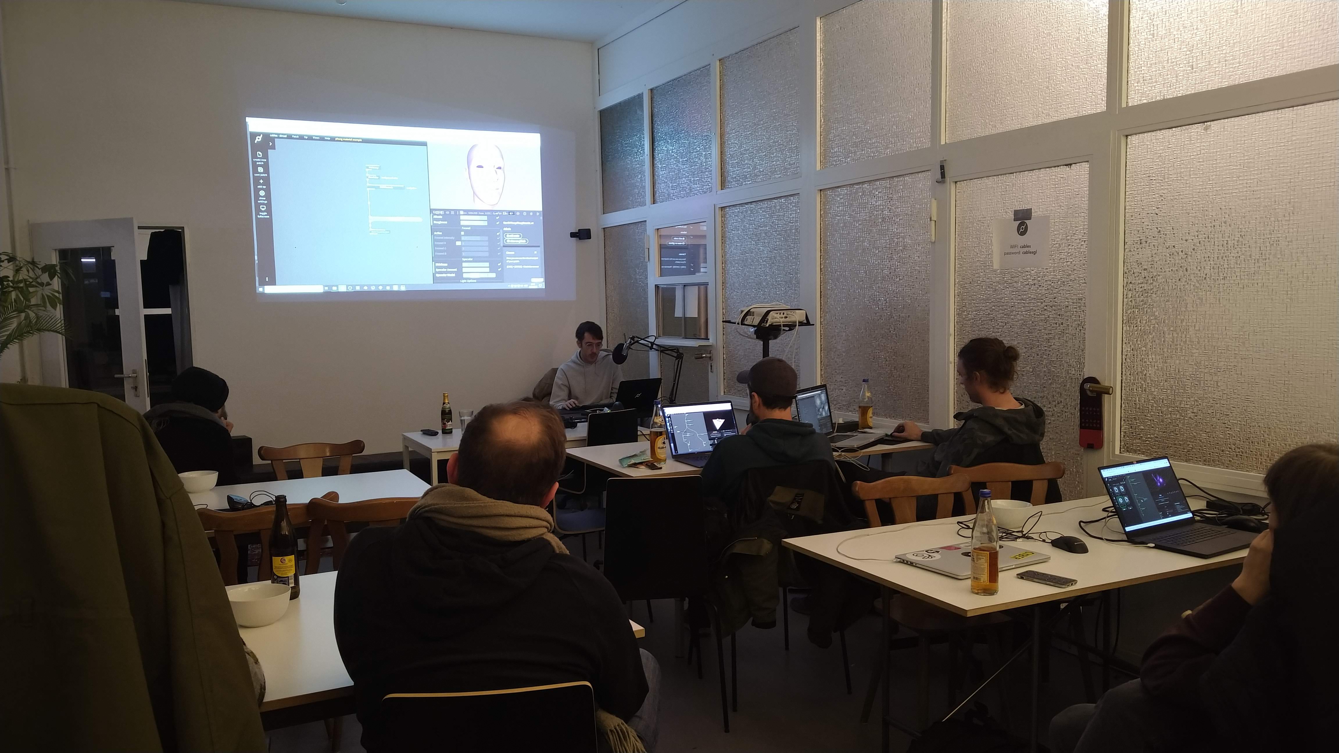
Our first cables meetup in Cologne was held at the offices of undev last tuesday.
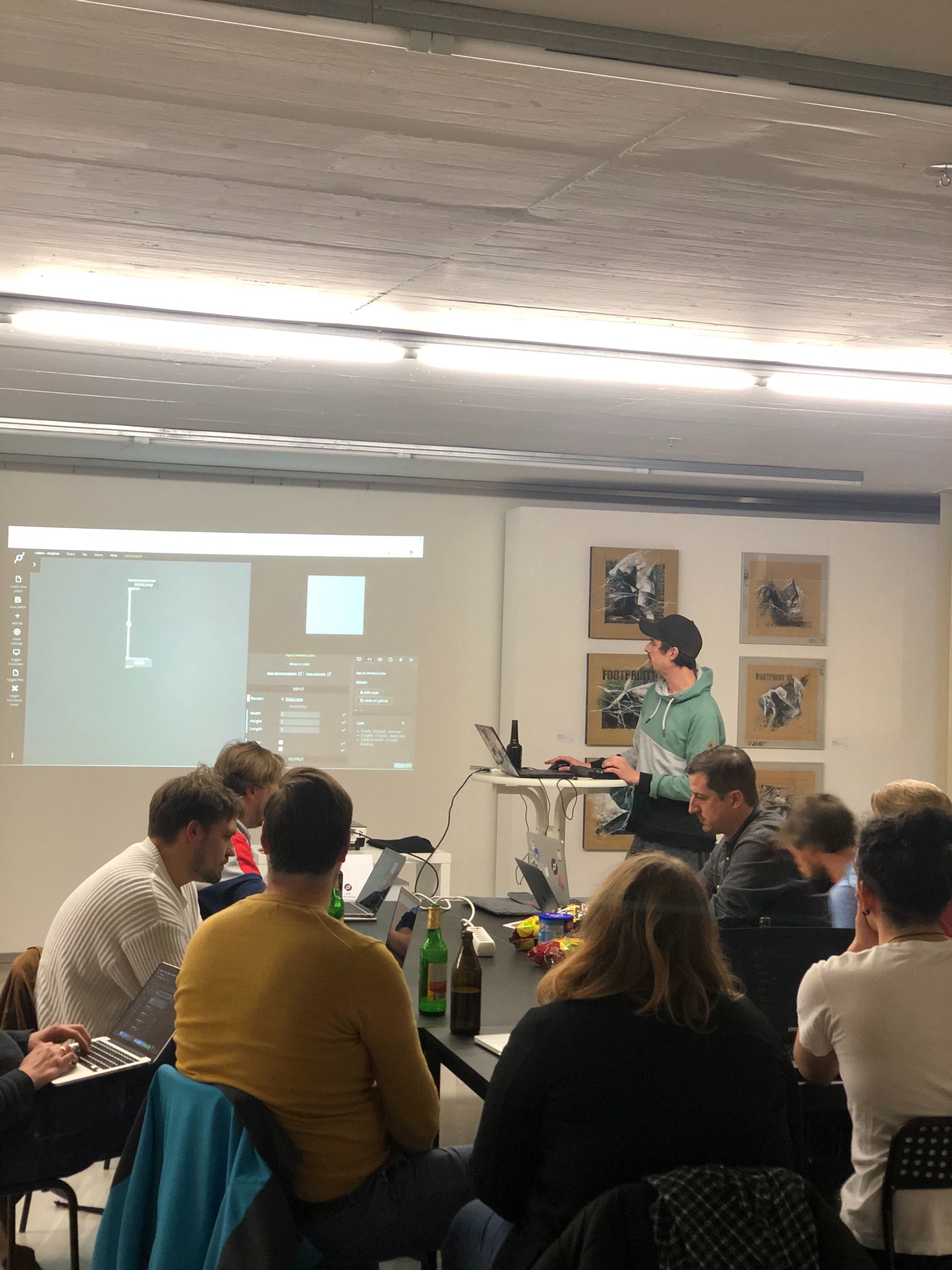
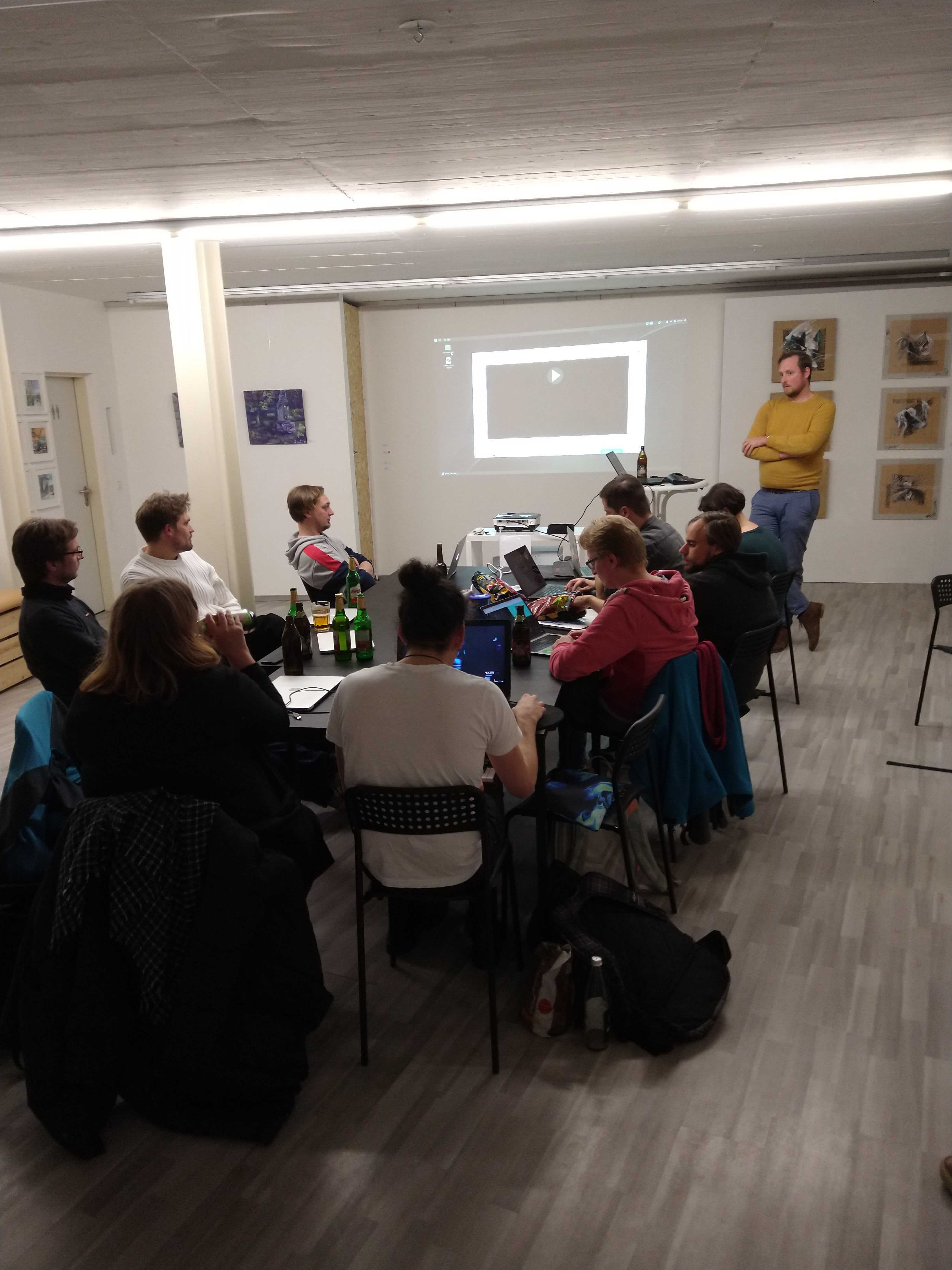
credits: photos by fraumimimi (left) and stephan (right)
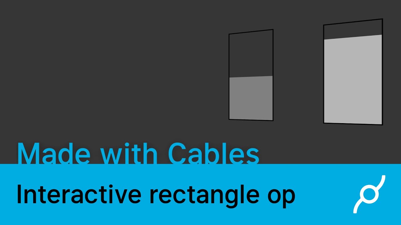
Learn how to use the interactive rectangle op to create an onscreen slider inside of cables with this new tutorial video.
We've been hard at work to roll out another update for cables gl.
From now on we will show you a summary of newest ops and features on this, our new blog 🙂


We integrated a new tab for the Keyboard shortcuts. Now you don't have to leave the editor to look at them. The list is not 100% complete right now, but will be extended in the near future.

Editor tabs now have a color coded type indicator, this makes it easier to find and read the tab you're searching for.
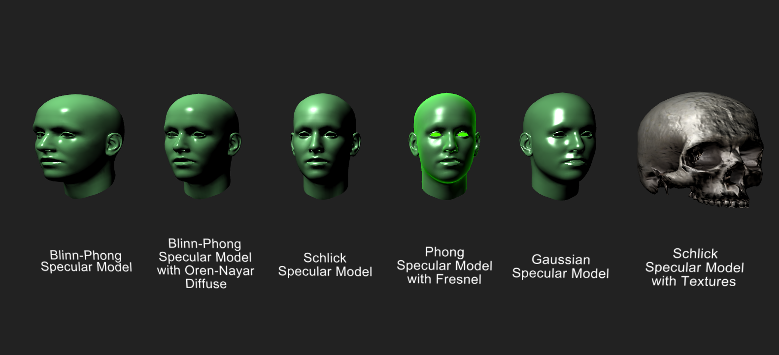
Phong material op has many more features and options than the previous versions.
We'd like to focus on people being active with cables in this upcoming meetup so we'll be giving a short beginners workshop that will last around an hour. This will start at 19:15.
After that we hope that you'll stick around and get creative with cables and ask us any questions you might have with patches your working on or things you may be stuck with.
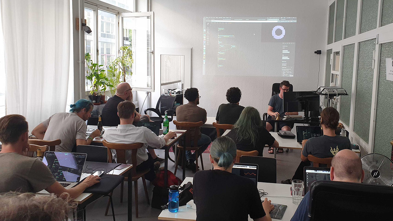
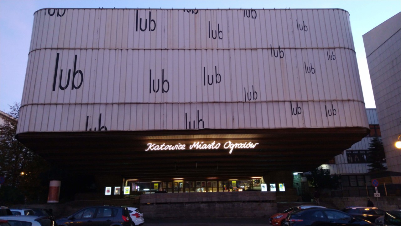
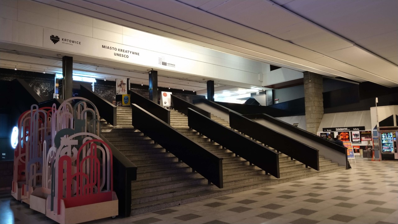
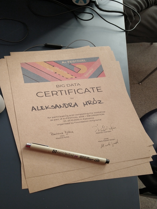
The nice people of antyRAMA organize a yearly festival spanning different fields of art, architecture, socialstudies, technology and more. This year we're proud to share that we were invited to hold a workshop on "data visualization" for the first three weekdays leading up to the main festival weekend.
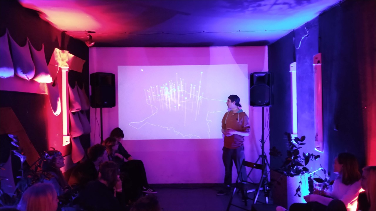
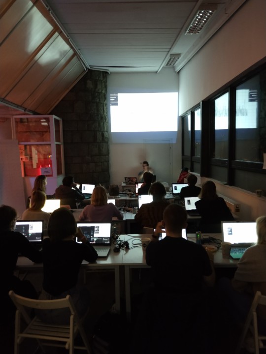
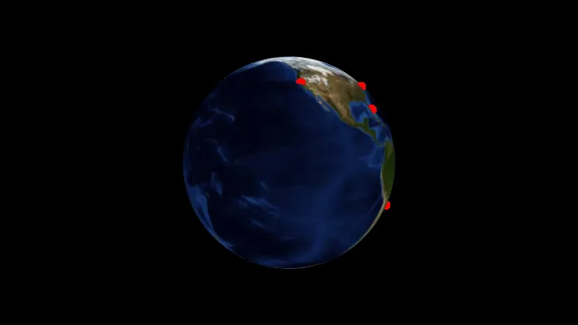
We held a mostly hands-on workshop on how to use cables in general, we added a bit of talk about the general problems when working with public data and then went on to show how to use cables to visualize data. The main idea was to take some "open data" provided by the Medialab Katowice to visualize the air pollution in the city.
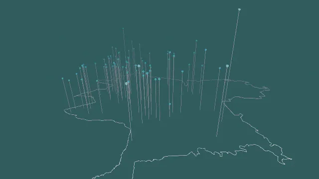
Our wonderful host told us that Katowice used to have/has a huge problem with pollution, mostly due to it's history in being a coal-mining city. We wanted to know whether the given data supported this, and if so which parts of the city suffered from this the most.
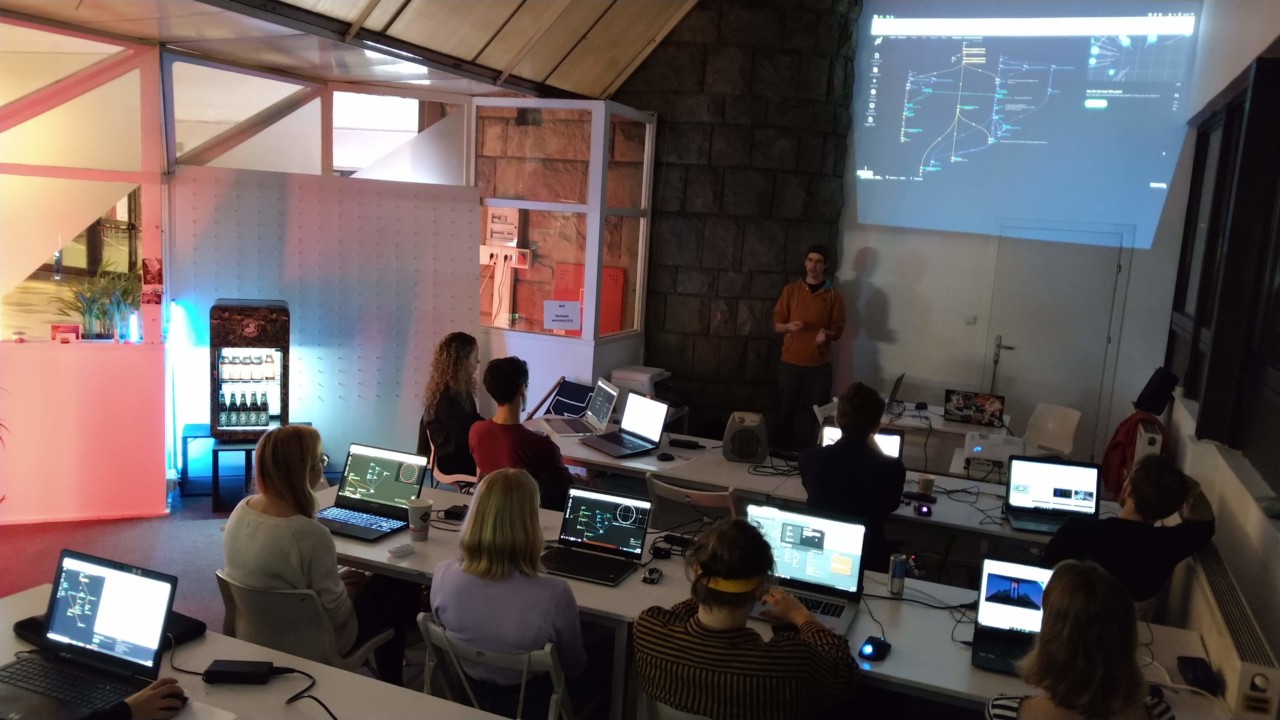
All participants were given the same set of data and a rundown on how to integrate this into their patches. In the end every participant went home with their own, individual representation of the air pollution in Katowice.
The final presentation consisted of one patch made by one participant of the workshop as well as our own interpretation of the data. Given the quite limited amount of time (about 12 hours of workshops) and also the fact that we started from scratch with a blank screen we were really impressed by the outcome. We hope the participants learned a lot of new things, we sure did learn a lot about teaching data visualization, working with geodata and CSV and how to run a supernice festival.
references:
A
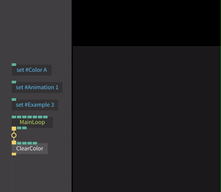
Viique's presented patch
cables patches shown/used